
This is the third and final part of the tutorial dedicated to one of the most used Mathematical tools in Game Development: linear interpolation! In this part, we will explore how to use it to correct colour curves.
- Part 1: Linear Interpolation
- Part 2: Piecewise Interpolation
- Part 3: Color Curve Correction
You can find a link to download the C# scripts and the Unity package used at the end of this post.
Introduction
In the previous post of this series we talked about piecewise linear interpolation (sometimes referred to as multilinear interpolation) and how it can be used—among many other applications—to create colour gradients.
This final post will show how to resampled colour gradients to satisfy certain specific properties, such as preserving brightness or luminosity. But before we delve into that, let’s start by creating a gradient first.
Many of you might be familiar with HSV colour gradient. This is made by lerping between a series of key colours: red, yellow, green, cyan, blue and purple:

These six key colours are equally distant from each other, and their position on the gradient is usually indicated with an angle. This is because the HSV colour space is often visualised a circle, where the angle—the hue—indicates the colour. The hue often goes from  to
to  degrees, but for this tutorial we will rescale it in the range to
  .
.
Creating an HSV gradient is trivial when we have access to the piecewise Lerp function described before. All that is needed is an array of key colours (Cs) and an array of equidistant values (Xs). The snippet below does exactly that, with Xs values ranging from to :
Color[] Cs = new Color[]
{
    Color.red,        // 0°
    Color.yellow,     // 60°
    Color.green,      // 120°
    Color.cyan,       // 180°
    Color.blue,       // 240°
    Color.purple,     // 300°
    Color.red,        // 360°
};
float[] Xs = new float[]
{
    0f/360f, 60f/360f, 120f/360f, 180f/360f, 240f/360f, 300f/360f, 360f/360f
};
To get the colour matching a specific hue, all we need to do now is to use the piecewise Lerp function:
Color c = Lerp (Xs, Cs, 30f/360f); // Between red and yellow
It is also relatively easy to create a texture with the desired gradient. In Unity, this can be done by placing the colours in an array (let’s call it pixels) which can then be used to initialise a Texture2D object.
Color[] pixels = new Color[N];

float step = 1.0 / (N-1);
for (int i = 0; i < N; i ++)
{
    float x = i * step;
    pixels[i] = Lerp(Xs, Cs, i);
}

Texture2D texture = new Texture2D(N, 1);
textue.SetPixels(pixels);
texture.Apply();
Now that we have a proper colour gradient, let’s see what’s wrong with it, and how we can fix it.
Luminance Curves
If you are familiar with colour gradients—and HSV colours in particular—you might also be familiar with one tricky problem they have. They rarely have constant “brightness”. In the gradient that we previously constructed, for instance, this should be obvious since the key colours that have been chosen have all different brightnesses. Pure red (new Color(1, 0, 0)) is brighter than pure blue (new Color(0, 0, 1)), and there is nothing that can be done about that. This tutorial will not address that: if you want those two colours to be in the gradient, the intermediate colours will necessarily have not only a hue gradient, but also a brightness gradient.
However, this tutorial will address a different, yet related problem. Because different key colours in the gradient will have different brightness, the brightness gradient among them will also be different. What this means is that while the six key colours that make up the HSV colour gradient are spaced equally spatially, their change is brightness does not.
This becomes apparent if we look at gradient again (below). The difference in brightness from blue and purple is much higher compared to the one between yellow and green. Yet, both segments takes exactly the same amount of space on the gradient.
This can sometimes be important. For instance, sampling the HSV colour spectrum at fixed intervals, does not guarantee colours with the same difference in brightness. And in game development, as in UX design, this can be a problem.
But before this problem can be addressed, we need to find a way to measure it. So far we talked about the “brightness” of a colour; we need a more formal metric. A good first approach is to calculate how “bright” each colour is calculating its relative luminance. That is a a formula that takes into account how sensitive the human eye is to each colour channel. For instance, humans are much more sensitive to green light than blue light. This means that two light sources of different colours will be perceived as having a different brightness even if they irradiate the same amount of energy.
Given the amount or red, green and blue in a colour ( ,
,  and
and  , respectively) its relative luminance
  is given by the following equation:
(1) 
which translated very easily to the following C# code:
float Luminance(Color color)
{
    return 0.2126f * color.r + 0.7152f * color.g + 0.0722f * color.b;
}
Now we can plot the relative luminance of colours across the HSV gradient, to discover that indeed is all over the place:
Because the key colours are equally spaced on the X axis, there are the same numbers of colours sampled in between two of them. But because nearby key colours have different relative luminance, the spacing of the intermediate colours on the Y axis changes from segment to segment. This is the problem that the rest of this tutorial will address.
📚 Colour Luminance
Calculating how “bright” a colour appears is far from trivial. The very existence of countless colour spaces should be enough of an indication that this is a complex topic; one that many people are strongly opinionated about.
Part of the complexity comes from the fact that different fields have different definitions for “brightness”, based on the specific problems they are trying to address.
For this tutorial, we have relied on the relative luminance, although that is only one among many other possible metric, such as: intensity, lux, luminance, brightness, and so on. Some are discussed in this Stack Overflow answer.
If you are interested in learning more about the perception of colours, I suggest reading Improving the Raindow, which talks about how the human eye perceives light. There are three separate receptors for light, which have wildly different sensitivity to specific wavelengths of light which loosely map to red, green and blue light:
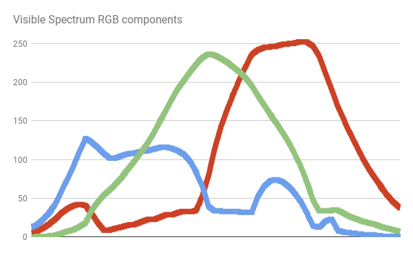
Similar curves are used to model how sensitive we are to different colours of light. That being said, humans also have a separate mechanism to perceive light in poorly lit environments which does not discriminate colours as well. And, to make it even more complicated, each eye is different and each person might have a slightly different sensitivity to colours.
Another important aspect to take into consideration is that equation (1) works for sRGB colours. Luckily for us, in Unity “colors are typically expressed in sRGB color space”, as indicated by the official documentation (here).
⭐ Recommended Unity Assets
Unity is free, but you can upgrade to Unity Pro or Unity Plus subscription plans to get more functionalities and training resources for your games.
Curve Resampling
Now that we know what the problem is, we can start thinking about a proper solution. We do not want to change the relative luminance of the key colours, since they are what defines the HSV gradient. This automatically means that we cannot ensure that the difference in relative luminance ( ) across all nearby key colours stays the same. To refer to the chart above, this means that we cannot ensure that the six segments will have the same height. Yet, there is one thing that we can change: the positions on the X axis of key colours. Right now, they are equally spaces on gradient: we must move them to ensure that the distance from their neighbouring key colours is proportional to their difference in relative luminance. Graphically, this means that if two key colours have very similar relative luminance, they will be much closer than two key colours with a larger difference.
The first step is to calculate the total difference in relative luminance across the key colours. This is done by calculating such difference for all nearby key colours in the gradient:
// Calculates cumulative deltaL
float cumulativeDeltaL = 0;
for (int i = 1; i < Cs.Length; i++)
    cumulativeDeltaL += Mathf.Abs(Luminance(Cs[i]) - Luminance(Cs[i-1])); // [0,1]
Since can range anywhere from  to
to  , it is important to take its absolute value.
Once we know the total amount of difference in relative luminance across the key colours, we can reposition each one proportionally to its :
float[] RXs = new float[Xs.Length]; // resampled X uniformly
RXs[0] = 0; // The first element stays at 0

float cumulativeDeltaX = RXs[0];
for (int i = 1; i < Xs.Length; i++)
{
    float deltaL = Mathf.Abs(Luminance(Cs[i]) - Luminance(Cs[i-1])); // [0,1]
    float deltaX = deltaL / cumulativeDeltaL; // [0,1]
    cumulativeDeltaX += deltaX;
    RXs[i] = cumulativeDeltaX;
}
The new gradient looks something like this:

The most immediate thing that can be noticed is that the key colours have been moved along the gradient, and that they do not occupy the same space. The hue does not increase linearly anymore, but the difference in relative luminosity across nearby key colours does.
And this becomes apparent if we plot the relative luminosity once again:
Now all points are equally spaced.
We can also see this by comparing how the individual segments/gradients have been stretched and compress, as if the differences in relative luminosity were related to the stiffness of springs inside the gradients:

Solutions
There is another good way to show how powerful this technique is: a black and white gradient. The image below shows how an arbitrary black and white gradient is resampled so that its perceived luminance is increasing linearly. This also means that, no matter how stretched or compressed the original gradient is, as long as the colour keys are sorted, this technique will produce the same uniformly distributed gradient.

You might not like these new gradients that were generated, and that is ok. While we talked about relative luminance, it is ultimately not the aim of this series to create the “perfect” colour gradient. There are much better solutions out there to resample colours under uniform luminosity. One such is the Oklab colour space, recently developed by Björn Ottosson. It allows to sample gradients with varying hue but constant lightness and chroma.
So why using the colour curve resampling technique described in this tutorial? For one simple reason: it is parametric. The Oklab—like all of the other colour spaces—have been designed to solve a specific problem, and only that one. You can use the curve resampling technique to alter the gradient to fit potentially any function you can came up with. It is inexpensive to run, and can be used to produce a gradient as either a lookup texture, or a piecewise interpolator.
Ultimately, there is no one colour space that rules them all. But this new technique is another useful tool to have when working with colours and gradients.
Conclusion…
- Part 1: Linear Interpolation
- Part 2: Piecewise Interpolation
- Part 3: Color Curve Correction
Download Unity Package
Become a Patron!The Standard package contains the script to perform piecewise linear interpolation. It uses extension methods which allows to easily interpolated numbers, vectors, colours and even quaternions! The Advanced package, instead, contains a test scene which also shows how to correct colour curves.
Leave a Reply