

Our journey to photorealism requires us to understand not only how light works, but also how we perceive colours. How many colours are in the rainbow? And why pink is not one of them? Those are some of the questions that this post will address.

You can find the complete series here:
- Part 1. The Nature of Light
- Part 2. Improving the Rainbow (Part 1)
- Part 3. Improving the Rainbow (Part 2)
- Part 4. Understanding Diffraction Grating
- Part 5. The Mathematics of Diffraction Grating
- Part 6. CD-ROM Shader: Diffraction Grating (Part 1)
- Part 7. CD-ROM Shader: Diffraction Grating (Part 2)
- Part 8. Iridescence on Mobile
- Part 9. The Mathematics of Thin-Film Interference
- Part 10. Car Paint Shader: Thin-Film Interference
A link to download the Unity project used in this series is also provided at the end of the page.
Introduction
This post will introduce the most common techniques used in computer graphics to reproduce the colours that appear in the rainbow. While this might seem a useless exercise, it actually has very practical applications. Each colour of the rainbow corresponds to a specific wavelength of light. This correspondence will allow us to simulate physically based reflections.
The second part of this post, Improving the Rainbow – Part 2, will introduce a novel approach that is highly optimised for shaders, yet yielding the best results so far (see below).
A comparative WebGL versions of all the techniques discussed in this tutorial can be found on Shadertoy.
Colour Perception
The retina is the part of the eye that is specialised in the detection of light. In there, cone cells are able to send signals to the brain when they detect certain wavelengths of light. Since light is a wave in the electromagnetic field, cone cells work under the same principles that allow us to detect radio waves. Cone cells are, de-facto, tiny antennas. If you have studied electronics, you should know that the length of an antenna is related to the wavelength it captures. This is why the human eye features three different types of cone cells: short, medium and long. Each one is specialising at detecting a particular range of wavelengths.
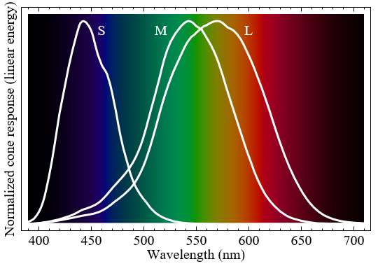
The diagram above shows how strongly each cone cell type reacts to different wavelengths. When one of those cone types activate, the brain interprets their signal as colour. Despite what often stated, the short, medium and long cone cells do not represent specific colours. More correctly, each type responds differently to a different range of colours.
It is incorrect to assume that short, medium and long cone cells detected blue, green and red light. Despite this, many textbooks (and even shaders!) rely on this assumption to get a relatively acceptable approximation of an otherwise very complex phenomenon.
Spectral Colour
If we want to reproduce the physical phenomena that make iridescence possible, we need to re-think the way we store and manipulate colours in a computer. When you create a light source in Unity (or any other game engine) you can specify its colour, as a mixture of three primary components: red, green and blue. While it is certainly true that red, green and blue lights can be mixed up to create all the visible colours, this is not how light really works at its most fundamental level.
A light source can be modelled as a constant stream of photons. Photons which carry different amounts of energy are perceived by our eyes as different colours. However, there is no “white photon”. It is the sum of many photons, each one with a different wavelength, that gives a light its white appearance.
What we will need for the future posts in this series is being able to talk about the very building blocks of light. When we will talk about “wavelengths” you should think about specific colours of the rainbow. This post shows different approaches to make that connection possible. What we want to achieve is, ultimately, a function that given the wavelength of a light wave returns its perceived colour:
fixed3 spectralColor (float wavelength);
For the rest of this series, we will express wavelength in nanometres (a billionth of a meter). The human eye can perceive lights ranging from 400 nm to 700 nm. Wavelengths outside that range do exist but are not perceived as colours.
❓ Why isn't there an optimal solution?«There is no unique one-to-one mapping between wavelength and RGB values. Color is a wonderful combination of physics and human perception.»
The quest for the ultimate map from wavelengths to colours is inevitably doomed to fail. While the nature of light is objective, its perception is not. Cone cells, which are responsible for the perception of specific wavelengths of the visible spectrum present significant variation among different people. Even assuming all cone cells to work uniformly and consistently among humans, their distribution and numbers within the retina are mostly random. No two retinas are the same; not even from the same subject.
Finally, the perception of colour depends on how the brain interprets those inputs. That allows for a variety of optical illusions and neural adaptations which make the perception of colours a unique and truly personal experience.
Spectral Map
The following image shows how the human eye perceives wavelengths ranging from 400 nanometers (blue) to 700 nanometers (red).

It is easy to see that the distribution of colours in the visible spectrum is highly nonlinear. If we plot, for each wavelength, the respective R, G and B components of its perceived colour, we will end up with something like this:
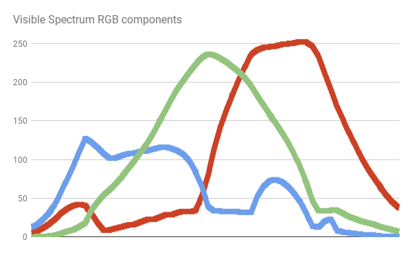
There is no simple function that can fully reproduce that curve. The easiest, cheapest approach we can implement is simply using that texture in our shader as a mean to map wavelengths to colours.
The first step is to make a new texture available in the shader. We can do this by adding a texture property to the Properties block a new shader.
// Properties
Properties
{
    ...
    _SpectralTex("Spectral Map (RGB)",2D) = "white" {}
    ...
}
// Shader code
SubShader
{
    ...
    CGPROGRAM
    ...
    sampler2D _SpectralTex;
    ...
    ENDCG
    ...
}
Our spectralColor function only remap wavelengths in the range [400,700] onto UV coordinates in the range [0,1]:
fixed3 spectral_tex (float wavelength)
{
    // wavelength: [400, 700]
    // u:          [0,   1]
    fixed u = (wavelength -400.0) / 300.0;
    return tex2D(_SpectralTex, fixed2(u, 0.5));
}
In this specific case, we don’t need to enforce wavelength in the range [400, 700]. If the spectral texture is imported with Repeat: Clamp, any value outside that range will automatically appear as black.
❓ Sampling textures in a loop...JET Colour Scheme
Sampling a texture might seem a good idea. However, it could drastically slow down put shader. We will see our critical this is in the post on CD-ROMs iridescence where each pixel would require several texture samples.
There are several functions that approximate the distributions of colours of the light spectrum. One of the simplest is possibly the JET colour scheme. This is the default colour scheme in MATLAB, and it was originally devised to better visualise astrophysical fluid jet simulations from the National Center for Supercomputer Applications.

The JET colour scheme is the combination of three different curves: a blue, green and red one. This is clearly highlighted by colour decomposition:
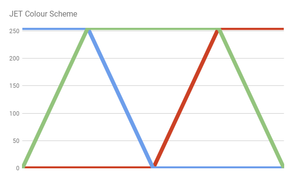
We can easily reimplement the JET colour scheme by writing the equations of the lines that make up the diagram above.
// MATLAB Jet Colour Scheme
fixed3 spectral_jet(float w)
{
	// w: [400, 700]
	// x: [0,   1]
	fixed x = saturate((w - 400.0)/300.0);
	fixed3 c;

	if (x < 0.25)
		c = fixed3(0.0, 4.0 * x, 1.0);
	else if (x < 0.5)
		c = fixed3(0.0, 1.0, 1.0 + 4.0 * (0.25 - x));
	else if (x < 0.75)
		c = fixed3(4.0 * (x - 0.5), 1.0, 0.0);
	else
		c = fixed3(1.0, 1.0 + 4.0 * (0.75 - x), 0.0);

	// Clamp colour components in [0,1]
	return saturate(c);
}
The R, G and B values of the resulting colour are capped in the range [0,1] using the Cg function saturate. If your camera is set to HDR (High Dynamic Range Rendering), this is necessary to avoid colours with components that go above 1.
Please, note that if you want to adhere strictly to the JET colour scheme, values outside the visible range will not be black.
Bruton Colour Scheme
Yet another approach to convert wavelengths to visible colours is provided by Dan Bruton in “Approximate RGB values for Visible Wavelengths“. Similarly to what happened for the JET colour scheme, he starts from an approximated distribution of how colours are perceived.

His approach, however, better approximates the activity of the long cone cells, showing a more violet hue towards the lower end of the visible spectrum:

Which translated into the following code:
// Dan Bruton
fixed3 spectral_bruton (float w)
{
	fixed3 c;

	if (w >= 380 && w < 440)
		c = fixed3
		(
			-(w - 440.) / (440. - 380.),
			0.0,
			1.0
		);
	else if (w >= 440 && w < 490)
		c = fixed3
		(
			0.0,
			(w - 440.) / (490. - 440.),
			1.0
		);
	else if (w >= 490 && w < 510)
		c = fixed3
		(	0.0,
			1.0,
			-(w - 510.) / (510. - 490.)
		);
	else if (w >= 510 && w < 580)
		c = fixed3
		(
			(w - 510.) / (580. - 510.),
			1.0,
			0.0
		);
	else if (w >= 580 && w < 645)
		c = fixed3
		(
			1.0,
			-(w - 645.) / (645. - 580.),
			0.0
		);
	else if (w >= 645 && w <= 780)
		c = fixed3
		(	1.0,
			0.0,
			0.0
		);
	else
		c = fixed3
		(	0.0,
			0.0,
			0.0
		);

	return saturate(c);
}
Bump Colour Scheme
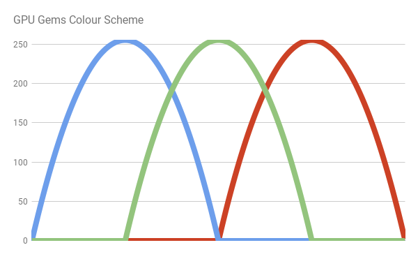
Both the JET and Bruton colour schemes use discontinuous functions. As such, they feature quite sharp colour variations. Moreover, they do not fade to black outside the visible range. The book GPU Gems addresses those issue by replacing the sharp lines of the previous colour schemes with more gentle bumps. Each bump is simply a parabola of the type  . More specifically:
![\[bump\left(x \right ) = \left\{\begin{matrix} 0 & \left|x\right|>1 \\ 1-x^2 & \mathit{otherwise} \end{matrix}\right.\]](https://www.alanzucconi.com/wp-content/ql-cache/quicklatex.com-a58afacd74770cfed062b7fd1c4ca23e_l3.png "Rendered by QuickLaTeX.com")
The author, Randima Fernando, uses a bump for each colour component, arranged in the following way:

We can write the following code:
// GPU Gems
inline fixed3 bump3 (fixed3 x)
{
	float3 y = 1 - x * x;
	y = max(y, 0);
	return y;
}

fixed3 spectral_gems (float w)
{
   	// w: [400, 700]
	// x: [0,   1]
	fixed x = saturate((w - 400.0)/300.0);

	return bump3
	(	fixed3
		(
			4 * (x - 0.75),	// Red
			4 * (x - 0.5),	// Green
			4 * (x - 0.25)	// Blue
		)
	);
}
An additional advantage of this colour scheme is that it does not use texture samples or branches, making it one of the best solution if you prefer performance over quality. At the end of this tutorial, you will see a revised version of this colour scheme which provides best performances while still yielding high fidelity of colours.
Spektre Colour Scheme
One of the most accurate colour scheme available has been made by Stack Overflow used Spektre. They explain their methodology in RGB values of visible spectrum, where they sampled the blue, green and components of real data from the solar spectrum. Then, they fit individual intervals with simple functions. The result is presented in the following diagram:
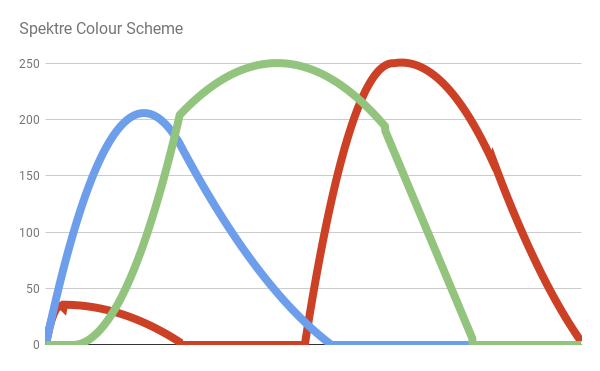
Which produces:

And here is the code:
// Spektre
fixed3 spectral_spektre (float l)
{
	float r=0.0,g=0.0,b=0.0;
			if ((l>=400.0)&&(l<410.0)) { float t=(l-400.0)/(410.0-400.0); r=    +(0.33*t)-(0.20*t*t); }
	else if ((l>=410.0)&&(l<475.0)) { float t=(l-410.0)/(475.0-410.0); r=0.14         -(0.13*t*t); }
	else if ((l>=545.0)&&(l<595.0)) { float t=(l-545.0)/(595.0-545.0); r=    +(1.98*t)-(     t*t); }
	else if ((l>=595.0)&&(l<650.0)) { float t=(l-595.0)/(650.0-595.0); r=0.98+(0.06*t)-(0.40*t*t); }
	else if ((l>=650.0)&&(l<700.0)) { float t=(l-650.0)/(700.0-650.0); r=0.65-(0.84*t)+(0.20*t*t); }
			if ((l>=415.0)&&(l<475.0)) { float t=(l-415.0)/(475.0-415.0); g=             +(0.80*t*t); }
	else if ((l>=475.0)&&(l<590.0)) { float t=(l-475.0)/(590.0-475.0); g=0.8 +(0.76*t)-(0.80*t*t); }
	else if ((l>=585.0)&&(l<639.0)) { float t=(l-585.0)/(639.0-585.0); g=0.82-(0.80*t)           ; }
			if ((l>=400.0)&&(l<475.0)) { float t=(l-400.0)/(475.0-400.0); b=    +(2.20*t)-(1.50*t*t); }
	else if ((l>=475.0)&&(l<560.0)) { float t=(l-475.0)/(560.0-475.0); b=0.7 -(     t)+(0.30*t*t); }

	return fixed3(r,g,b);
}
Conclusion
This post provides an overview of some of the most common techniques to generate rainbow-like patterns in a shader. The second part of this post, Improving the Rainbow – Part 2, will introduce a novel approach to solve this problem.
| Name | Gradient |
| JET | |
| Bruton | |
| GPU Gems | |
| Spektre | |
| Zucconi |  |
| Zucconi6 | |
| Visible | |
You can find the complete series here:
- Part 1. The Nature of Light
- Part 2. Improving the Rainbow (Part 1)
- Part 3. Improving the Rainbow (Part 2)
- Part 4. Understanding Diffraction Grating
- Part 5. The Mathematics of Diffraction Grating
- Part 6. CD-ROM Shader: Diffraction Grating (Part 1)
- Part 7. CD-ROM Shader: Diffraction Grating (Part 2)
- Part 8. Iridescence on Mobile
- Part 9. The Mathematics of Thin-Film Interference
- Part 10. Car Paint Shader: Thin-Film Interference
Become a Patron!
You can download the Unity package for the CD-ROM Shader effect on Patreon.
💖 Support this blog
This website exists thanks to the contribution of patrons on Patreon. If you think these posts have either helped or inspired you, please consider supporting this blog.
📧 Stay updated
You will be notified when a new tutorial is released!
📝 Licensing
You are free to use, adapt and build upon this tutorial for your own projects (even commercially) as long as you credit me.
You are not allowed to redistribute the content of this tutorial on other platforms, especially the parts that are only available on Patreon.
If the knowledge you have gained had a significant impact on your project, a mention in the credit would be very appreciated. ❤️🧔🏻
Webmentions
[…] 接下来是zucconi6渐变函数,这将产生明显的最佳颜色结果,所以这是我最喜欢的三种方法中的一种。此函数以创建此渐变代码的人 Alan Zucconi 命名。我强烈建议阅读他关于薄膜的系列,改进彩虹和他提出的任何其他内容,因为他很棒。 […]
[…] you are interested in learning more about the perception of colours, I suggest reading Improving the Raindow, which talks about how the human eye perceives light. There are three separate receptors for light, […]
[…] Alan Zucconi, the man who created the code for this gradient. I’d highly suggest reading his series on thin film, improving the rainbow and anything else he puts out because he’s […]
[…] 2. Improving the Rainbow (Part […]
[…] 2. Improving the Rainbow (Part […]
[…] 2. Improving the Rainbow (Part […]
[…] the previous part of this tutorial, Improving the Rainbow – Part 1, we have seen different techniques to reproduce the colours of the rainbow procedurally. Solving […]
[…] 2. Improving the Rainbow (Part […]