

Having worked both as a teacher and an artist, I know how important data visualisation is. This tutorial will teach you to create interactive network graphs with Python and JavaScript. You can have a go by dragging the nodes of the graph below…
- Step 1. The Graph
- Step 2. Interactive Graph
- Step 3. Customisation
- Conclusion
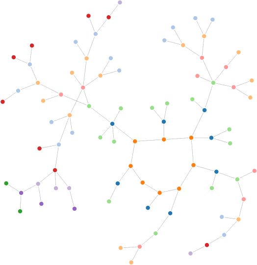
You can find a high resolution version of the melancoil tree (2000x2000px, first 1000 numbers) here: PNG, SVG, HTML.
Step 1. The graph
There are many libraries in Python that can handle network graphs; for this tutorial I’ve chosen NetworkX, which is quite easy to use. The first step is to create the graph, which can be done by simply adding the edges; this will also automatically add all the nodes.
The code below is used to calculate the Melancoil tree, as discussed by Matt Parker in an episode of Numberphile. The algorithm to generate them has been discussed in the tutorial Recreational Maths in Python.
import networkx as nx

G = nx.DiGraph()
for i in range(1,100):
	happy, tree = is_happy(i, [])

	# Skips happy numbers
	if happy:
		continue

	# Add the entire sequence to the tree
	for j in range(0,len(tree)-1):
		G.add_edge(tree[j], tree[j+1])
The result is a directed graph which represents how the non-happy numbers are connected.
Step 2. Interactive Graph
The way the network graph is going to be transferred to JavaScript is via JSON. The module json_graph allows to dump a NetworkX graph into a JSON file. Before doing that, you can add any additional parameter you want to the nodes or the edges. This can be very helpful to decide which colour to use, or which label to show on the graph.
import json
from networkx.readwrite import json_graph

for n in G:
    G.node[n]['name'] = n

d = json_graph.node_link_data(G)
json.dump(d, open('force/force.json','w'))
If you have a software which can read JSON network graphs, this is all you need. However, there are few interesting things you can still do. Following one of the examples on the NetworkX documentation (partially based on Mike Bostock‘s work), you can launch a browser page with an interactive version of the graph:
import http_server
http_server.load_url('force/force.html')
The Python script will keep running and serve as a local HTTP server on the port 8000. By visiting the address localhost:8000/force/force.html, you’ll see something like this:
The graph reacts to drag events and looks quite nice. Once the Python Script is closed, the HTTP server becomes unreachable; however you can simply copy the “force” folder onto your website and it will work just fine.
Step 3. Customisations
The network graph made However, there are no customisation options available from Python. If we want a fancier graph, we need to chance the JavaScript code that generates it. This is stored in the file force.js.
Nodes with style
The styles of the nodes can be changed by chaining a call to style while appending the nodes; this can be seen in line 37, which changes the node colours according to a property called group:
.style("fill", function(d) { return fill(d.group); })
This function is evaluated for each node, which is called d. Any property we previously added in Python is saved in the JSON, and can be recalled easily. For the network graph shown at the beginning of this page, these attributes and styles have been used:
.attr("r", function(d) { if (d.group == 0) return 20; return 15-d.group; })
.style("fill", function(d) { return d3.hsl(d.colour).brighter(d.group/3); })
.style("stroke-width", function(d) { if (d.group === 0) return 5; return 1; })
Both colour and group are properties that have been initialised by the Python script. The former indicates the base colour of the node, while the latter counts how far the node is from the melancoil loop.
The first change we need to do is to add labels to the nodes. In order to do this we have to create a container node which will host the circle and the text.
// Container
var node = vis.selectAll(".node")
    .data(force.nodes())
    .enter().append("g")
    .attr("class", "node")
    .call(force.drag);
// Circle
node.append("circle")
    .attr("class", "node")
    .attr("x", function(d) { return d.x; })
    .attr("y", function(d) { return d.y; })
    .attr("r", 5)
    .style("fill", function(d) { return fill(d.group); });
// Text
node.append("text")
    .attr("x", -10)
    .style("font-size", "10")
    .text(function(d) { return d.name; });
We also have to make sure that the new containers move when the graph is rearranged. To do so, we need to add these two lines in the force.on function:
node.attr("cx", function(d) { return d.x; })
    .attr("cy", function(d) { return d.y; });
Conclusion
If you are interested in this topic, you might also find the following tutorials interesting:
💖 Support this blog
This website exists thanks to the contribution of patrons on Patreon. If you think these posts have either helped or inspired you, please consider supporting this blog.
📧 Stay updated
You will be notified when a new tutorial is released!
📝 Licensing
You are free to use, adapt and build upon this tutorial for your own projects (even commercially) as long as you credit me.
You are not allowed to redistribute the content of this tutorial on other platforms, especially the parts that are only available on Patreon.
If the knowledge you have gained had a significant impact on your project, a mention in the credit would be very appreciated. ❤️🧔🏻
I get an error when I try to import http_server:
ModuleNotFoundError: No module named ‘http_server’
My Networkx is version 1.11, all other modules import just fine.
Am I missing something? I don’t see the entirety of code to produce the graph. Where is the is_happy def defined? This link (https://www.alanzucconi.com/2015/11/03/recreational-maths-python/) gives multiple versions of is_happy, none of which seem to work with the other code in this page.
Hi Tim!
The article shows how you can improve the function in different ways, based on your needs. This is why there are multiple versions of the same function.
It is hard to tell what is not working, because I don’t know how you have pasted the code. Is the function by itself working? Also, check the indentation, which can get messy when copying Python code from web pages.
Hi Alan. Can you publish the code, in a single place, for the interactive graph at the top of the page? The one where you can drag the numbered nodes and they bounce back? The one immediately following the phrase “You can have a go by dragging the nodes of the graph below…”
I understand about the indentation, but that is not the problem here. Having that working code in one place would greatly increase the usefulness of this article because it’d provide a complete working example before going into the customizations.
In this line of the JS modification you propose:
.style(“fill”, function(d) { return fill(d.group); }); });
There’s an extra “})” I think. It should be:
.style(“fill”, function(d) { return fill(d.group); });
I know this post is old, just wanted to put this here in case anyone else has this problem. Thanks for the tutorial !
Thank you for spotting that!
I’ve corrected the article!