

The filter
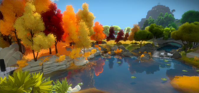
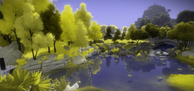
This tutorial will teach you how to create and use post-processing effects which simulate how colour blind players might experience your Unity game. One of my most anticipated games is The Witness; since it uses so many vibrant colours, it will be used as an example in this tutorial. This is how a player affected by red-green colour blindness (protanopia) might see it:
The image effect provided in this tutorial will help you understand which parts of your game are harder to see for color blind users.
Introduction
Colour blindness is a umbrella term that groups pathological variations in the perception of colours. Despite what the name suggests, the complete inability to see colours (achromatopsia) is an extremely rare condition. Almost three percent of the population has deuteranomaly, the most common form of colour blindness which affects the perception of green tones.
| Normal | – | |
| Protanope | (red) | |
| Deuteranope | (green) | |
| Tritanope | (blue) | |
| Anachromatope | (all) |
When a particular colour receptor is missing entirely, we have protanopia, deuteranopia and tritanopia. When instead they are present but defective or in reduced numbers, we have protanomaly, deuteranomaly and tritanomaly.
Testing your game
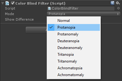
The first step is to download the ColorBlind Unity package specifically created for this tutorial. Once imported in your project, drag the script called ColorBlindFilter onto your main camera. You can change the Mode to alter colours according to the different types of colour blindness.
There is also an additional option, called Show Difference. When enabled, it shows the game in black and white, adding a red tone to the areas that are more affected by the selected type of colour blindness.

The picture above shows which parts of the game are more affected by protanopia
Accessibility design
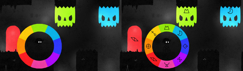
For most colour blind players, games that strongly reply on green and red can add an extra layer of challenge and frustration. It’s getting more and more common for developers to include a special option for colour blind users. FTL, for example, does this very nicely by ensuring that “no essential information is conveyed by a colour alone” (from Game accessibility guidelines):

This is possible even in games which are entirely based on colours, such as Hue. This upcoming 2D puzzle platformer has a colour blind mode which matches symbols to colours.
The tutorial
In this part we will explore how the create a filter to simulate the experience of players affected by colour blindness. This filter is based on an image effect (learn how to make one here: Screen shaders and image effects). It requires a fragment shader to alter colours, and a script which will re-direct all the incoming frames from a camera to it.
Step 1. The theory
All the different types of colour blindnesses can be simulated by mixing the RGB channels of an image by the right amount. The following table (from here) has been used for this effect:
| Red Channel | Green Channel | Blue Channel | ||||||||
| Type | % | R | G | B | R | G | B | R | G | B |
| Normal | 92% | 100% | – | – | – | 100% | – | – | – | 100% |
| Protanopia | 0.59% | 56.667% | 43.333% | – | 55.833% | 44.167% | – | – | 24.167% | 75.833% |
| Protanomaly | 0.66% | 81.667% | 18.333% | – | 33.333% | 66.667% | – | – | 12.5% | 87.5% |
| Deuteranopia | 0.56% | 62.5% | 37.5% | – | 70% | 30% | – | – | 30% | 70% |
| Deuteranomaly | 2.7% | 80% | 20% | – | – | 25.833% | 74.167% | – | 14.167% | 85.833% |
| Tritanopia | 0.016% | 95% | 5% | – | – | 43.333% | 56.667% | – | 47.5% | 52.5% |
| Tritanomaly | 0.01% | 96.667% | 3.333% | – | – | 73.333% | 26.667% | – | 18.333% | 81.667% |
| Achromatopsia | <0.001% | 29.9% | 58.7% | 11.4% | 29.9% | 58.7% | 11.4% | 29.9% | 58.7% | 11.4% |
| Achromatomaly | <0.001% | 61.8% | 32% | 6.2% | 16.3% | 77.5% | 6.2% | 16.3% | 32.0% | 51.6% |
Step 2. The shader
To achieve this effect, we create a shader called ChannelMixer which mixes the channels of a texture by the amount specified by its _R, _G and _B properties.
Properties
{
	_MainTex("Base (RGB)", 2D) = "white" {}
	_R("Red Mixing", Color) = (1,0,0,1)
	_G("Green Mixing", Color) = (0,1,0,1)
	_B("Blue Mixing", Color) = (0,0,1,1)
}
This is done in the fragment function:
fixed4 frag(v2f_img i) : COLOR
{
	fixed4 c = tex2D(_MainTex, i.uv);

	return fixed4
	(
		c.r * _R[0] + c.g * _R[1] + c.b * _R[2],
		c.r * _G[0] + c.g * _G[1] + c.b * _G[2],
		c.r * _B[0] + c.g * _B[1] + c.b * _B[2],
		c.a
	);
}
Step 3. The script
The final piece of this effect is the script, which has to be attached to the camera. It contains a list of the effects to be used, which is matched by a 2D array of Colors called RGB.
public enum ColorBlindMode
{
    Normal = 0,
    Protanopia = 1,
    Protanomaly = 2,
    Deuteranopia = 3,
    Deuteranomaly = 4,
    Tritanopia = 5,
    Tritanomaly = 6,
    Achromatopsia = 7,
    Achromatomaly = 8,
}
The shader previously created has to be wrapped into a material before being usable:
private Material material;
void Awake()
{
    material = new Material(Shader.Find("Hidden/ChannelMixer"));
    material.SetColor("_R", RGB[0, 0]);
    material.SetColor("_G", RGB[0, 1]);
    material.SetColor("_B", RGB[0, 2]);
}
The next step is to use the function OnRenderImage, which is called by Unity with the current frame from the camera. The frame is then passed through the shader via Graphics.Blit.
void OnRenderImage(RenderTexture source, RenderTexture destination)
{
	// No effect
	if (mode == ColorBlindMode.Normal)
	{
		Graphics.Blit(source, destination);
		return;
        }

	// Change effect
	if (mode != previousMode)
	{
		material.SetColor("_R", RGB[(int)mode, 0]);
		material.SetColor("_G", RGB[(int)mode, 1]);
		material.SetColor("_B", RGB[(int)mode, 2]);
		previousMode = mode;
	}

	// Apply effect
	Graphics.Blit(source, destination, material);
}
The script sets the mixing properties of the material only if a change has occurred.
Step 4. Color difference
If you want to go a step further, you can also include an additional option which highlights which parts of the image are most affected. It shows a greyscale version of the image, colouring in read the parts which are most affected.
fixed4 frag(v2f_img i) : COLOR
{
	fixed4 c = tex2D(_MainTex, i.uv);

	// Color blind
	fixed3 cb = fixed3
	(
		c.r * _R[0] + c.g * _R[1] + c.b * _R[2],
		c.r * _G[0] + c.g * _G[1] + c.b * _G[2],
		c.r * _B[0] + c.g * _B[1] + c.b * _B[2]
	);

	// Bw
	fixed lum = c.r*.3 + c.g*.59 + c.b*.11;
	fixed3 bw = fixed3(lum, lum, lum);

	// Difference
	fixed3 diff = abs(c.rgb - cb);
	return fixed4(lerp(bw, fixed3(1, 0, 0), saturate((diff.r + diff.g + diff.b) / 3)), c.a);
}
You can see this effect here:
Comparisons
Protanopia
Deuteranopia

Tritanopia

Achromatopsia

Download
Download
This tutorial provides the ColorBlind Unity package to test how robust your game is in respect to colour blindness.
Conclusion
Approximately 8% of the population has a colour vision deficiency. The challenge is not designing a game that is pleasant for color blind players, but a game that they can easily play. If part of your gameplay relies on colours, try to use different patterns to keep a high visibility. Designing accessible games is expensive, but can potentially help you reaching a broader audience.
Other resources
- Game accesibility guidelines
- What is like to play videogames when you’re colorblind
- Gaming with colour blindness
💖 Support this blog
This website exists thanks to the contribution of patrons on Patreon. If you think these posts have either helped or inspired you, please consider supporting this blog.
📧 Stay updated
You will be notified when a new tutorial is released!
📝 Licensing
You are free to use, adapt and build upon this tutorial for your own projects (even commercially) as long as you credit me.
You are not allowed to redistribute the content of this tutorial on other platforms, especially the parts that are only available on Patreon.
If the knowledge you have gained had a significant impact on your project, a mention in the credit would be very appreciated. ❤️🧔🏻
Thank you, this is one of best articles I found so far on this topic. Keep up good work.
Thank you so much Peter!
This is great, but I think there is some additional brightness being included in the colour-blindness conversion.
I’m red-green colour blind and normally when I see the Before/After images they are indistinguishable for me, however with the Before/After screenshot of The Witness I can see the brightness changing, particularly on the trees on the left.
It’s not that I’m seeing any extra information, but it is easily distinguishable from the original.
Have you included the correct sensitivity weightings for red/green/blue light in the human eye? Perhaps it is slightly too low for the green component.
Really great work though! I’m wondering now if I can make a plugin that sort of does the opposite, takes a game that I’ve made and shows me the information a non colour-blind person would see, kind of remapping the similar colours onto a part of the spectrum I can distinguish.
Is it brighter or darker to you? Those transformations do not preserve brightness and my intuition says that result will be usually darker than what a colour blind person would see.
Interesting! 🙂
This is a very commendable Enterprise you got going on here, keep up the awesome work!
As to color matching symbols you could check out this labeling system developed by a great group of people from my country that started as a helper for clothes matching and has been widely implemented here in Portugal coloradd.net. Cheers!
Alan, thank you for the fantastic work and exemplary script.
I am a rank beginner with C# and Unity, and I ran into several issues testing the script in a finished build (despite it working in the editor). For anyone else struggling to execute the script at build stage, try Project Settings>Graphics>Built-in Shader Setting>Always Included Shaders and add Hidden/ChannelMixer from Alan’s package assets. For some reason, the latest version of Unity omits the custom shader from the build unless explicitly included, causing a Null Exception error.
Thank you for reporting that.
I did write the article in 2015/2016, so it seems Unity has made some changes in the meanwhile.
Great article !
Question, would that effect be possible using a post processing profile ?
Thanks
Hey! It is definitely possible. You can use Lookup Tables for color grading. You can find some here: http://eppz.eu/blog/design-color-blind-users/ but I didn’t test them.
Hi Alan. Just wanted to thank you for this great article and tutorial. I have been able to implement your tutorial into an application I am developing for mobile and it’s worked perfectly!
That’s great!
Feel free to send me the link, I’d love to see it!
And if you think this has helped, would be really happy to have a mention in the credits hehe!
How do i change the colour blind option via a button on click?